If you can interpret these they provide good material for conclusions (monetary policy, recession etc.). The first shows Fed hiking cycles and recessions - most, but not all, were followed by recessions:
The next is how long after the first hike the recession began; it is 25 months since the Fed's first hike:
Next is the infamous yield curve:
The grey bars are recessions. Look at the inversion points and note that the inversion declined (usually) before recession hit.
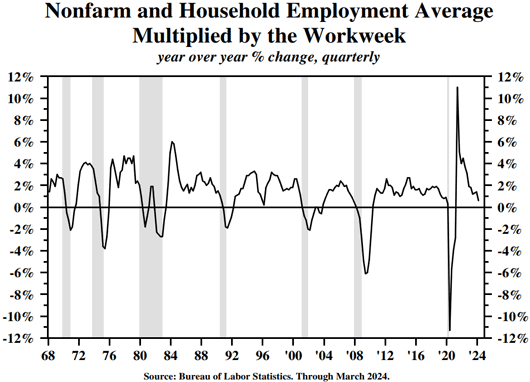
Finally, some job numbers. This is the US Non-farm payroll, THE most closely watched employment number; that last release (Friday) was a "miss" - 240,000 jobs forecast, actual was 170,000:


No comments:
Post a Comment